Color Palettes That Make Your Art Pop
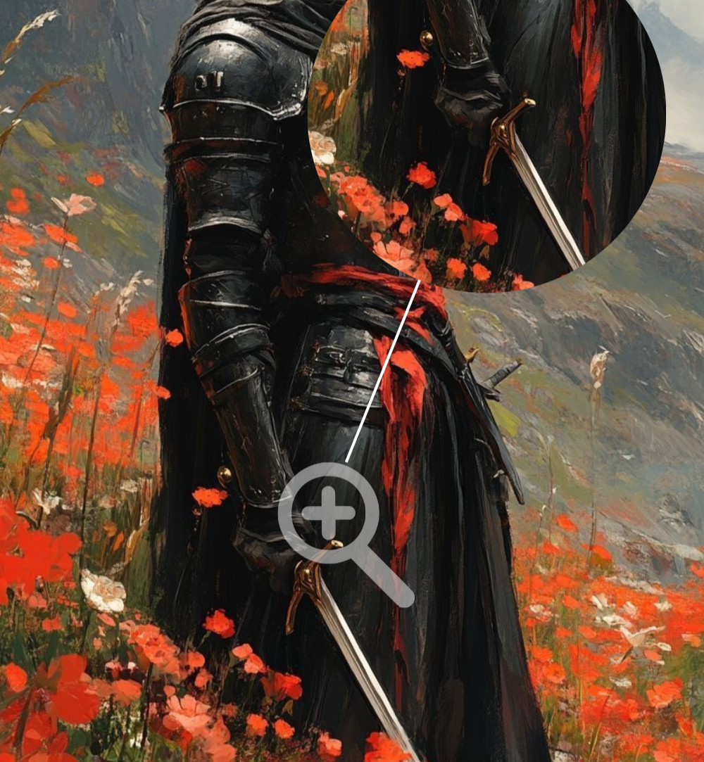
Black & Red
Drama by design.
This palette is bold, emotional, and intensely graphic. It doesn’t rely on detail to make an impact. Contrast does the heavy lifting. When used effectively, black and red can turn even simple compositions into statements.
Why Black & Red Works So Well
Black creates weight. Red brings emotion (anger).
Together, they establish tension before the viewer even processes what happened. This is why the palette shows up so often in pop culture imagery tied to power, rebellion, danger, and intensity. It’s not subtle, but that’s kinda the point.
Because the palette is so limited, every mark matters. Shapes read faster. Silhouettes feel stronger. The image stays memorable long after you scroll past it.
How to Use the Palette Without Overdoing It
The key is restraint. Let black do most of the work as negative space or shadow. Use red sparingly. It’s powerful as a highlight, accent, or emotional signal.
Make it stand out
Think glowing eyes in darkness. A single red garment against a black field. Sharp red roses cutting through a field of grass. The less red you use, the better. This is where your tool kit matters.
To explore this cleanly, it helps to work on a surface that handles contrast well. A sketchbook with smooth, bright paper built for high contrast keeps reds from dulling into mud.
Mood Variations Within the Palette
Not all reds feel the same.
Crimson = Dramatic. Cinematic
Scarlet = Aggressive and loud
Deep wine = Adds sophistication and restraint
Pair these with different blacks (pure black, charcoal, or textured dark tones). That way you can shift the mood without expanding the palette. Consider an iPad and reliable software (Procreate). Also, the Apple MacBook Air w/ M2 has a wonderfully vibrant screen for editing.
When to Choose Black & Red
This palette works best when your concept is clear and confident. It’s ideal for:
High impact character portraits
Poster-style compositions
Emotionally charged settings

If your goal is subtlety, this isn’t the palette.
But if you want instant presence, black and red delivers.
Working with bold markers, acrylic paint pens, or a limited digital brush set helps keep the execution as focused as the palette itself [affiliate link].
Let Contrast Carry the Work
Black and red don’t need decoration.
When you trust contrast over variety, your art feels sharper, louder, and more deliberate. That’s when a piece stops blending in with the crowd.